- Swingly
- Posts
- Breakouts Are Failing. Here’s Why We’re Stepping Back.
Breakouts Are Failing. Here’s Why We’re Stepping Back.
In partnership with
OVERVIEW
A False Start and a Technical Trap
🟥 Risk-Off: Breakouts are failing, not running. Leadership across tech, semis, and crypto is beginning to stall, while extended indices like QQQ are showing classic signs of exhaustion. Volume is thinning as price climbs. This is not a breakdown — but it is a clear message to step back and protect risk.
📊 Broad Market Structure: Momentum is compressing. QQQ has surged over 45 percent in 75 sessions, but weekly volume is fading. Breadth remains constructive, yet setups are decaying, and the edge for new entries is diminishing fast. Heavy supply sits above on the VRVP, with visible hesitation across the board.
🏗️ Midcaps and Small Caps Rolling Over: Both MDY and IWM reversed their Wednesday gap-ups and are now threatening deeper pullbacks into thin volume zones. The 50-day and 10-week EMAs in MDY around 563–565 are likely magnets if this slide continues. Failed breakouts in these groups tell us the tape is not yet ready to trend.

MARKET ANALYSIS
The Pause After the Push
Markets are taking a breather following one of the strongest multi-month rallies of the the last few years. The move has been sharp, broad, and relentless- and now, we are finally starting to see signs of fatigue.
Despite 83 percent of S&P 500 companies beating earnings estimates so far, the market’s reaction has been muted at best. That tells us the issue right now isn’t the number, but it’s positioning. A name like GOOG can report solid earnings, but if it’s up 45% percent over the last 15 weeks, good news just isn’t enough anymore. That’s a classic sign of a crowded long environment.
The same goes for most earnings-based episodic pivots this season. Strong prints are not being chased, instead they’re being sold into. That’s not bearish in isolation, but it is a message: the market needs time to digest.
Geopolitically, optimism around trade deals- including progress on a U.S.-Japan pact and renewed engagement with Indonesia- gave spirits a boost earlier this week. But none of it has moved the needle in terms of risk appetite. What’s driving this tape now is not headlines, but how far we’ve already run.
Nasdaq
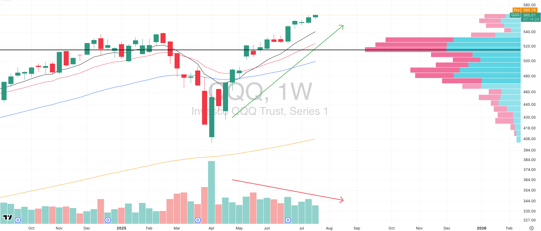
QQQ VRVP Weekly Chart
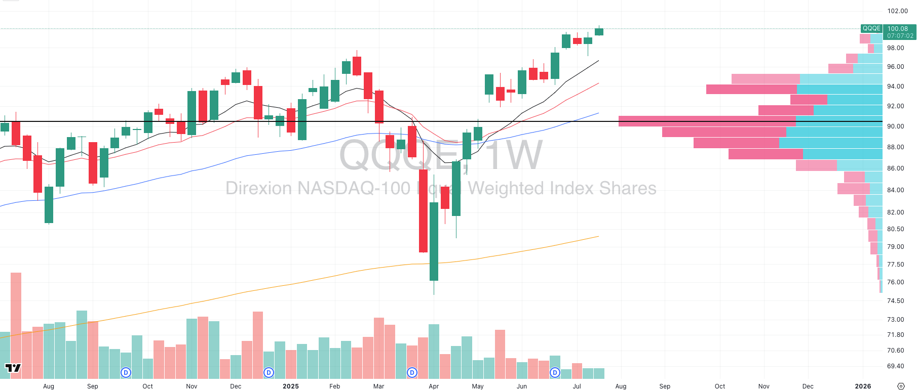
QQQE VRVP Weekly Charts
Zooming out to the weekly chart, the Nasdaq has just completed a +45% rally in only 75 trading days. That pace of advance, at this market cap scale, is extreme by any historical standard. Very few trends move this far, this fast, without consequence.
But now comes the critical part: deterioration without disruption.
Here’s what we’re seeing:
Weekly volume has started to decline, even as price pushes vertically into new highs. That’s a classic exhaustion divergence. In strong trends, volume expands with price. Here, it’s contracting.
The Visible Range Volume Profile (VRVP) shows heavier supply above $560. That’s where trapped volume starts to accumulate which is a signal smart money is selling into strength, not chasing.
Meanwhile, several of the core Nasdaq leaders are stalling on the weekly- extended, fading momentum, some breaking below short-term trend levels for the first time in months.
We’re also seeing the same dynamic- but even more exaggerated- in QQQE, the equal-weight Nasdaq 100. Price is lagging, and the internal structure looks weaker. This tells us the rally is becoming top-heavy, increasingly driven by fewer names.
None of this screams reversal. But what it does say, clearly, is that asymmetry for trend traders is deteriorating. The edge is not gone, but it’s no longer broad-based. When price goes vertical and volume decays, the next move is often chop, reset, or rotation.
This is where smart capital backs off the gas and lets the tape come to them.
S&P 400 Midcap
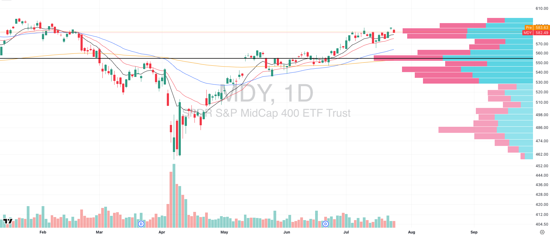
MDY VRVP Daily Chart
Midcaps tried to break higher on Wednesday with a strong gap up and bounce off the rising 10-day EMA on elevated volume, but that breakout has already failed. Instead of follow-through, we’re now seeing price fade back toward that same 10-day, signaling a fast reversal.
This kind of action is telling. In healthy tape, breakouts stick. In this environment, they’re getting faded almost immediately. It speaks to a market where conviction is thinning and setups are not being chased.
Here’s the key structure to watch:
The Visible Range Volume Profile (VRVP) shows a heavy supply zone sitting above the 20-day EMA, stretching up toward all-time highs. Every time we push into that band, sellers show up.
If MDY fails to hold the rising 20-day EMA at $575.80, there’s a low-volume pocket on the chart all the way down to the rising 50-day EMA near $563.25- a thin area that often gets filled fast.
Supporting this downside test is the 10-week EMA, which is also sitting around $565, adding timeframe confluence and making this a likely magnet if momentum doesn’t reassert quickly.
This isn’t a breakdown yet, but it’s a failure-to-launch setup. In these zones, breakout buyers get trapped, liquidity thins, and momentum traders step aside.
Every choppy day we get without follow-through makes a retest of the 50-day and 10-week cluster more and more probable.
Russell 2000
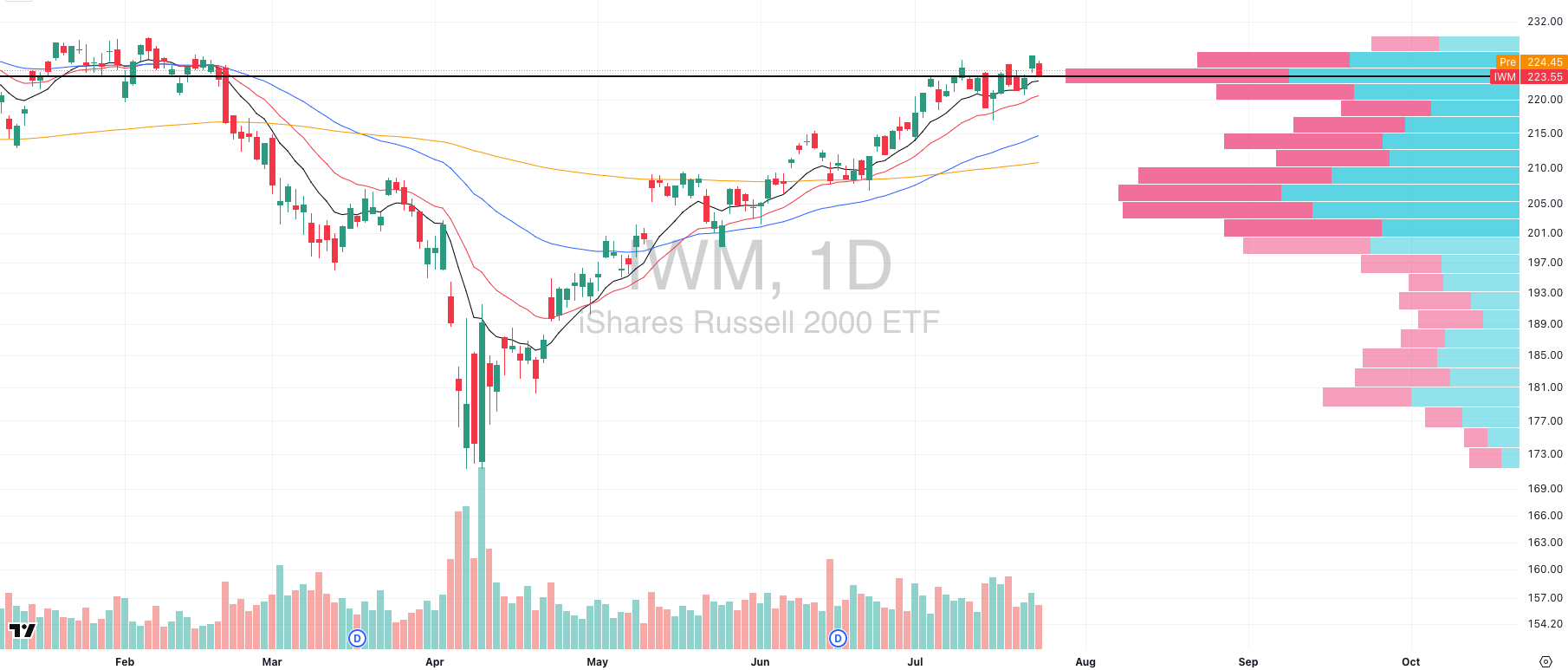
IWM VRVP Daily Chart
Small caps showed the most promising structure earlier this week, with a strong breakout above their Point of Control (POC) on Wednesday. But that move has now failed too as price has filled the gap and rolled back down, making another test of that same POC.
The technicals here mirror the breakdown in midcaps, so we won’t repeat the levels. What matters now is the context.
Pullbacks like this are not bearish…they are necessary.
Too often, traders interpret failed breakouts as negative signals. But structurally, these resets serve a purpose. They flush weak hands. They reset overbought conditions. And most importantly, they help reveal where true relative strength is hiding.
When everything is rallying in unison, it’s hard to distinguish leadership from sympathy. But during pullbacks, the picture clears. The stocks and sectors that hold higher ground, pull back orderly, or build tight flags during a broad market fade are often the ones that lead the next leg up.
🧠 Mindset Check: The Most Difficult phase for trend traders
This is the part of the market cycle that grinds people down quietly.
We are not seeing a crash. The indices still look strong. Volatility is low. Breadth is holding up. Everything on the surface seems fine. But if you are a trend trader, you can feel it in your equity curve. Something is off.
Setups that used to work are now stalling. Breakouts look perfect, then roll over a day later. Leaders that held the 10 and 20 day moving averages for months are starting to crack. Even strong earnings beats are being sold into instead of chased.
This is where momentum fades, but the trend has not yet broken. And that is exactly what makes it so difficult.
⚠️ The Trap Is Subtle
This phase plays tricks on you. The charts still look bullish. The data still looks supportive. But your actual trades are not paying. You are still following your process, but the reward side of the equation has vanished.
That is what compression looks like. The market is not punishing enough to scare people out, but not rewarding enough to justify staying aggressive. It is the zone where most trend traders overtrade, chop themselves up, and give back months of steady progress.
📉 Rotation Is Trying to Start
We are seeing early signs of sector rotation. Small caps, industrials, maybe even energy are starting to show relative strength. But it is messy. Nothing is clean.
The names that worked through Q2 are stretched or rolling over. The potential new leaders are not ready yet. So you are stuck in the middle — caught between watching old winners fade and trying to anticipate new ones that are still forming.
This is where conviction gets tested. This is where traders start pressing buttons out of frustration instead of edge.
🧭 This Is the Real Performance Risk
Historically, this type of tape is where many professional systems show their weakest stats. Win rates drop. Follow-through disappears. And traders start making emotional adjustments that do more harm than good.
It is not because your process is broken. It is because the market is not giving edge right now. Your job is to recognize that and respond with control, not force.
🔑 What the Best Traders Are Doing Right Now
They are not disappearing. They are just doing less.
The pros are tightening their entry criteria, trimming position size, and focusing on observation. They are watching for subtle accumulation in under-the-radar names. They are respecting the tape and waiting for leadership to reemerge.
You do not win in this environment by pushing harder. You win by staying ready without bleeding yourself out while things reset.
If this stretch has felt harder than it should, you are not alone. This is one of the toughest spots for trend traders because it demands patience without obvious payoff.
Inside Swingly PRO, we are breaking this down in real time. The setups that still have edge. The sectors showing early strength. The risk management shifts that keep you in the game until momentum returns.
Smart Investors Don’t Guess. They Read The Daily Upside.

Markets are moving faster than ever — but so is the noise. Between clickbait headlines, empty hot takes, and AI-fueled hype cycles, it’s harder than ever to separate what matters from what doesn’t.
That’s where The Daily Upside comes in. Written by former bankers and veteran journalists, it brings sharp, actionable insights on markets, business, and the economy — the stories that actually move money and shape decisions.
That’s why over 1 million readers, including CFOs, portfolio managers, and executives from Wall Street to Main Street, rely on The Daily Upside to cut through the noise.
No fluff. No filler. Just clarity that helps you stay ahead.
FOCUSED STOCK
APP: A Very Stubborn Tech Stock
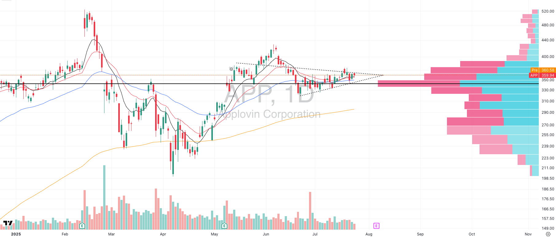
APP VRVP Daily Chart
We’re not looking to add tech exposure here, especially with the group extended and leadership starting to stall. But APP is a textbook example of the type of structure we want to track on our watchlist.
APP has been building a multi-month base, quietly holding above its Point of Control (POC) and now starting to tighten up just ahead of earnings. The setup is clean, controlled, and showing no signs of forced breakout behavior — exactly what we want to see during a market reset.
No trade yet. But in an environment where breakouts are failing and follow-through is rare, these are the charts worth flagging early.
FOCUSED GROUP
WCLD: The Next Leading Segment?
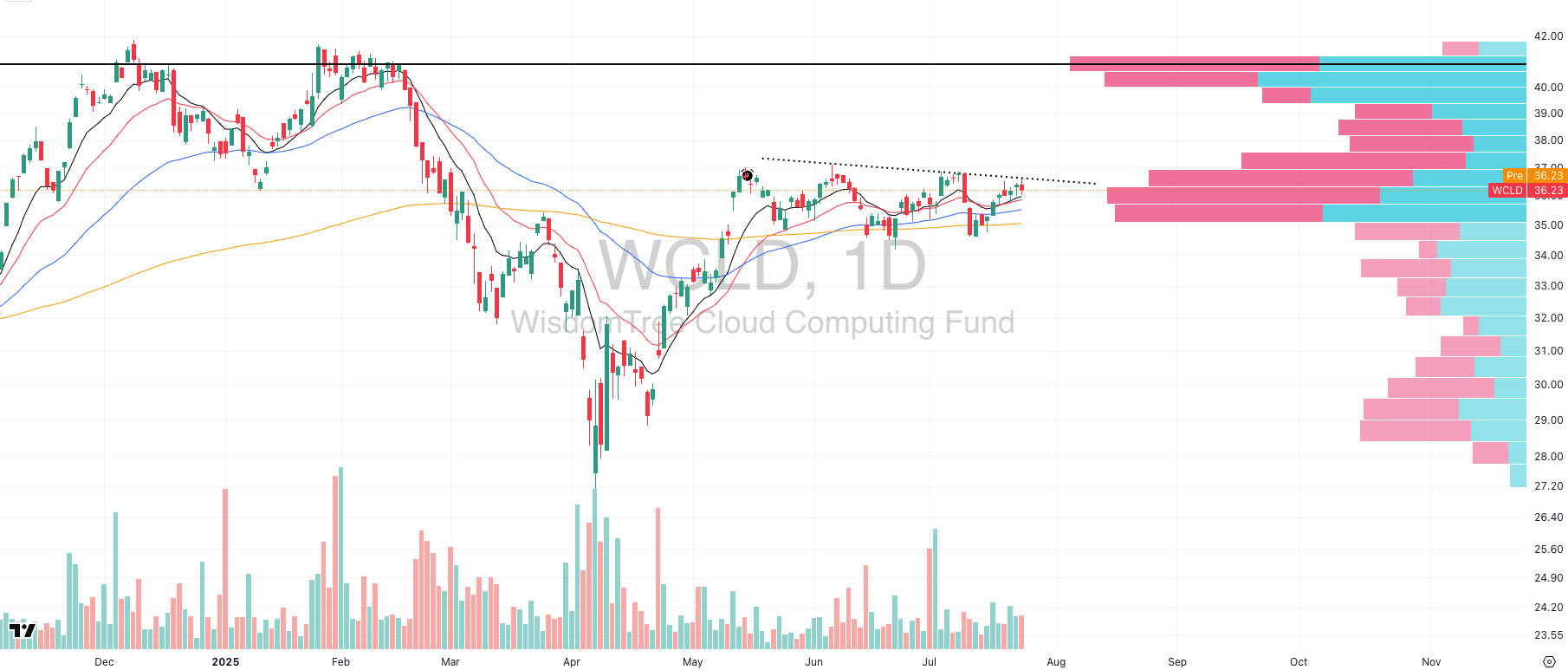
WCLD VRVP Daily Chart
Just like APP is quietly setting up at the stock level, WCLD (Cloud Computing ETF) is showing one of the cleanest base-building patterns at the sector level, and it’s flying under the radar.
After months of sideways action, WCLD has now formed a clear double bottom along its rising 200-day EMA, with zero signs of breakdown. Sellers have tested this level multiple times, but there’s been no sustained weakness, and buyers continue to step in just above key demand zones.
This structure matters. WCLD represents the next layer of the AI trade- the application and productivity side of cloud software that comes after semis and infrastructure. And while chip names are extended and starting to cool, WCLD is tightening up at the right spot.
If rotation is real, this could be one of the first groups to break higher in the next wave.
Here’s what we’re seeing:
Price is coiled just above a major volume node on the Visible Range Volume Profile
Relative strength vs QQQ is starting to improve
The entire group is showing controlled basing, not chop or weakness
No need to front-run it. But this is exactly the type of structure that often emerges as new leadership once crowded trades roll over.
Keep WCLD and the strongest cloud names close…this could be the next group to go.

Did you find value in today's publication?This helps us better design our content for our readers |
Reply